She loved the elements of this wordmark I put together for her instantly! After a few sizing tweaks (and a few different ampersand options), we were set with her new logo!
Branding Case Study: Faith + Fare
July 17, 2024
Food Blogger's New Logo + More
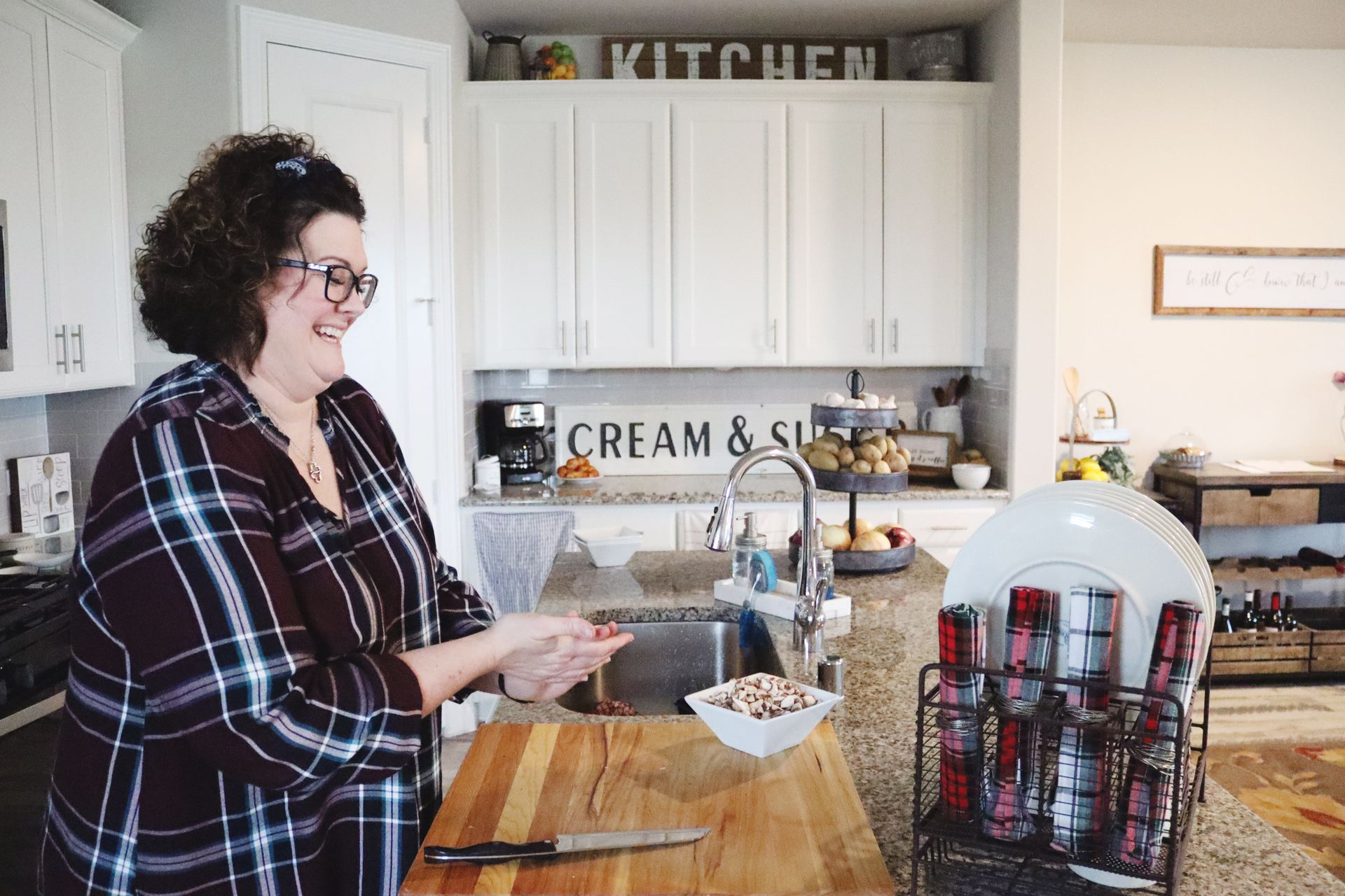
My friend DeeAnn can COOK. She measures with her heart and brings her best to the table every time, and if you're lucky enough to sit down and eat with her, you'll get the best stories and conversation, too! I'm saying your belly will be full of food, but your abs will be sore from laughter. It's the best pain you'll ever be in, I promise.
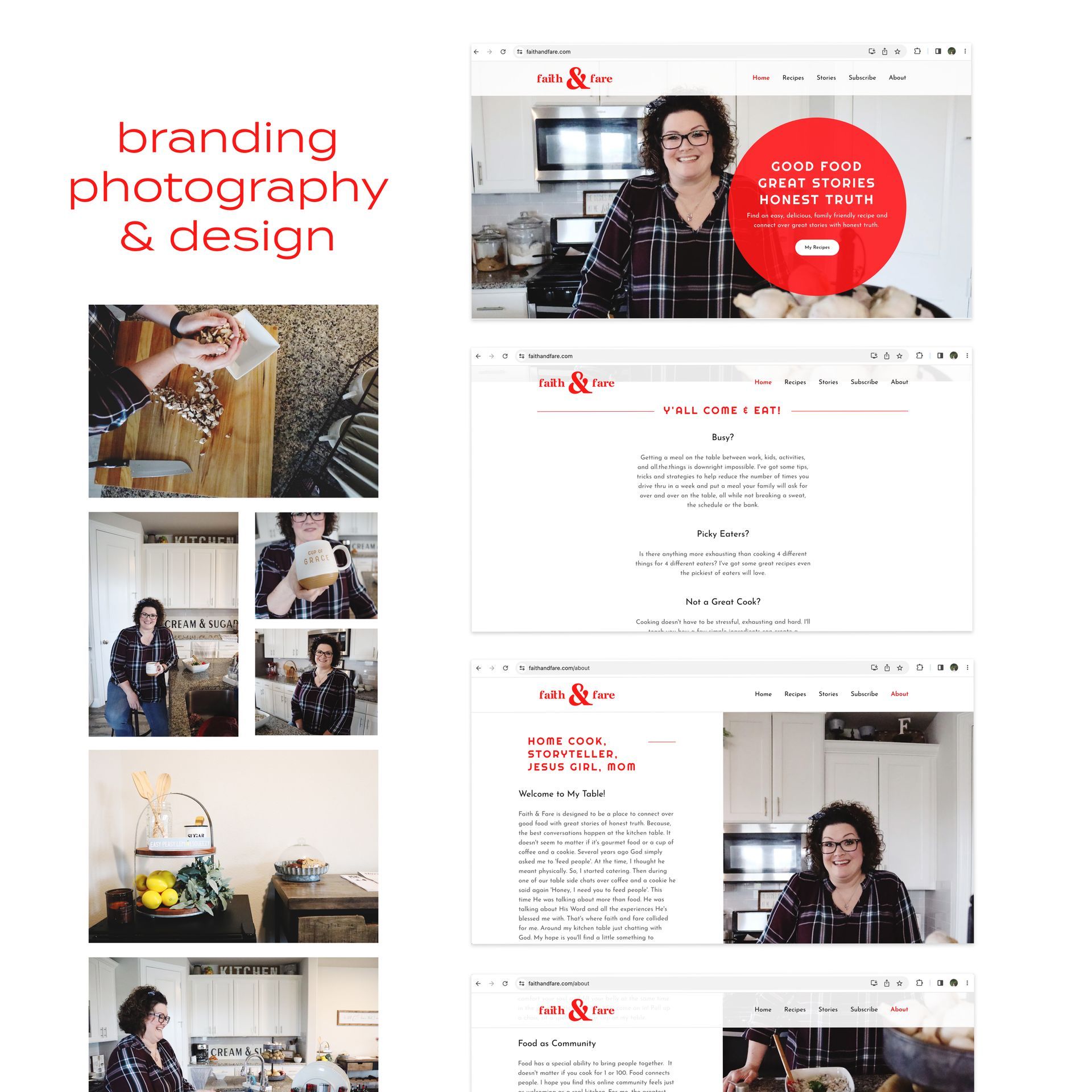
DeeAnn came to me a few years back, before I had started Sarah Rosie Studios or anything, and asked me about a logo for her new food blog. She wanted a place to share recipes, stories, and lessons she's learned walking with God over her hardworking years as a single mom.
She had thought of a name, and knew she liked the colors associated with an old fashioned diner, but she wanted it to look a little bit cleaner and more modern.
We sat down at the kitchen table together, talked through the terminology and tag lines she wanted to use, and then split up so I could work on her brand visuals.
It didn't take long to get the rest of the elements together after that. We scheduled a branded photo session in her kitchen, I created a Canva Brand Kit for her to easily implement her new logo, fonts, and colors, and she was good to go!
She immediately got it implemented on her blog, and had it looking clean and modern with a touch of old fashioned diner — just the way she hoped. If you're needing some inspiration to feed your fam this week, check out her amazing recipes!! My favorite is probably the short ribs... ooh girl.
Sarah Rosie is a freelance branding photographer and designer in Dallas, Texas. She's got your back on creative projects for your small business or nonprofit.
Contact her at sarahrosiestudios.com/contact/ to get started on your creative project today.
Sarah Rosie is a freelance branding photographer and designer in Dallas, Texas. She's got your back on creative projects for your small business or nonprofit.
Contact her at sarahrosiestudios.com/contact/ to get started on your creative project today.
start a conversation: share this post
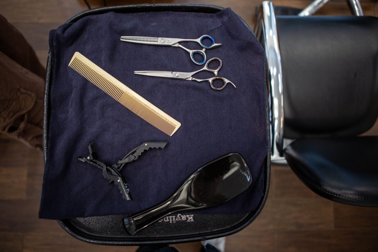
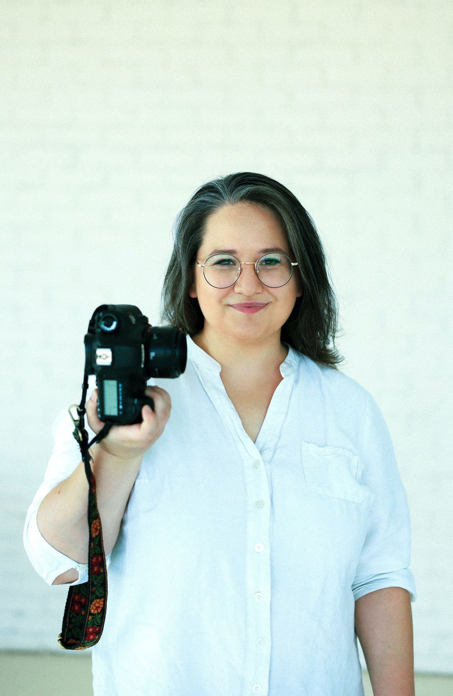
Branded photo session Peyton Williams - a local stylist at an upscale Dallas hair salon.
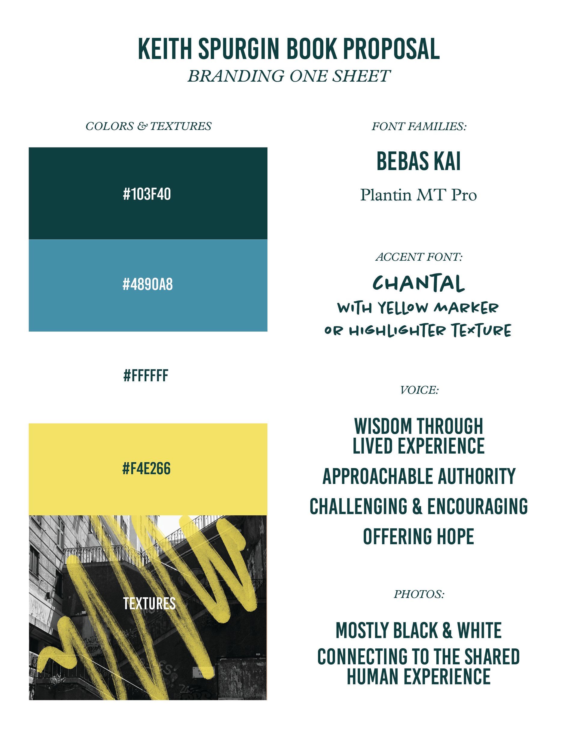
Graphic design and branding for an author and speaker's book proposal Keith had already spent years developing the content for his new book—now that it was ready to be sent to publishers, it's time to set up a brand kit to visually represent the content and make the proposal that much more effective! Step 1: Research the Existing Brand Identity Because Keith had been teaching and living the content of his new book for years, there is already a "brand" that exists: Keith himself! As a leader, preacher, teacher and coach, Keith has a strong identity with the people who already know him. It's my job to capture that and leverage it to help communicate who he is, and why his book will be worth publishing and distributing. I created a Brand Discovery Quiz that leads my clients through some questions that help us identify the positioning, tone, language, colors, fonts, and more that will help establish the visual identity and messaging for the brand. Taking my clients through the Brand Discovery Quiz is one of my favorite parts of this whole process. Not only does it challenge the way they've thought about communicating their work in the past, it also starts to help educate them about the ways different fonts, colors, and words communicate on a subconscious level. Some people may find the quiz a little more challenging than they expected, which is why I give them plenty of time to take the quiz before we move forward on the work. Step 2: Mini Style Guide After Keith completed the quiz, I took his answers and created a custom Mini Style Guide : a one-page document that establishes the colors, fonts, brand voice, and even photography and textures! I knew Keith wanted a fairly toned-down and professional color palette that looked kinda sleek but still approachable. I gave him simple-but-upscale fonts for his main titles and copy typography, but wanted to add an accent that would add some "passionate teacher" vibes. That's where the handwritten style font and yellow highlighter/marker texture came from! These added touches brought another layer of energy and authority, while keeping some fun in the mix. Side note... It's key to point out here that determining the "Voice" of the brand is just as important to this process as anything else; in fact, nailing the voice and positioning is a key part of picking out the fonts, colors, and visuals to begin with! People may think that the branding process is as simple as choosing a cute color palette or the most trendy fonts, but the best brands start a lot deeper, require time, research, and even basic understanding of psychology and marketing/communication to be as effective as possible. Without intentional goals, and a "why" behind each branding choice, a brand kit would just be a collection of hex codes and random vector files. But maybe that's a longer conversation for another day!
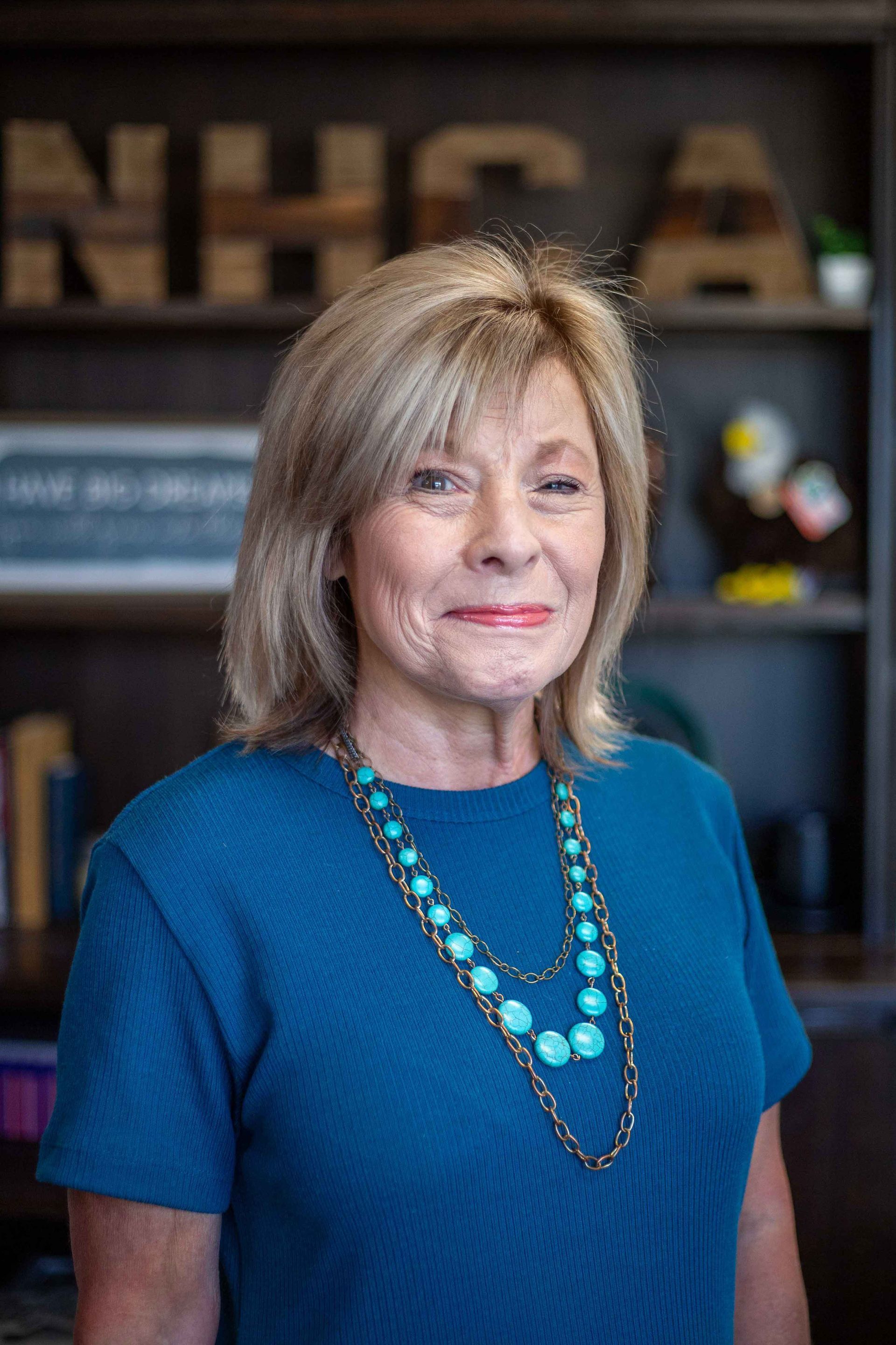
Branded Portraits / Corporate Headshots for School Principal DeeDee Mims is an educational entrepreneur in Plano, TX. She started New Hope Christian Academy with an incredible vision to provide a unique education option for families in North Texas, and has created something special for the students, parents, and whole families involved.
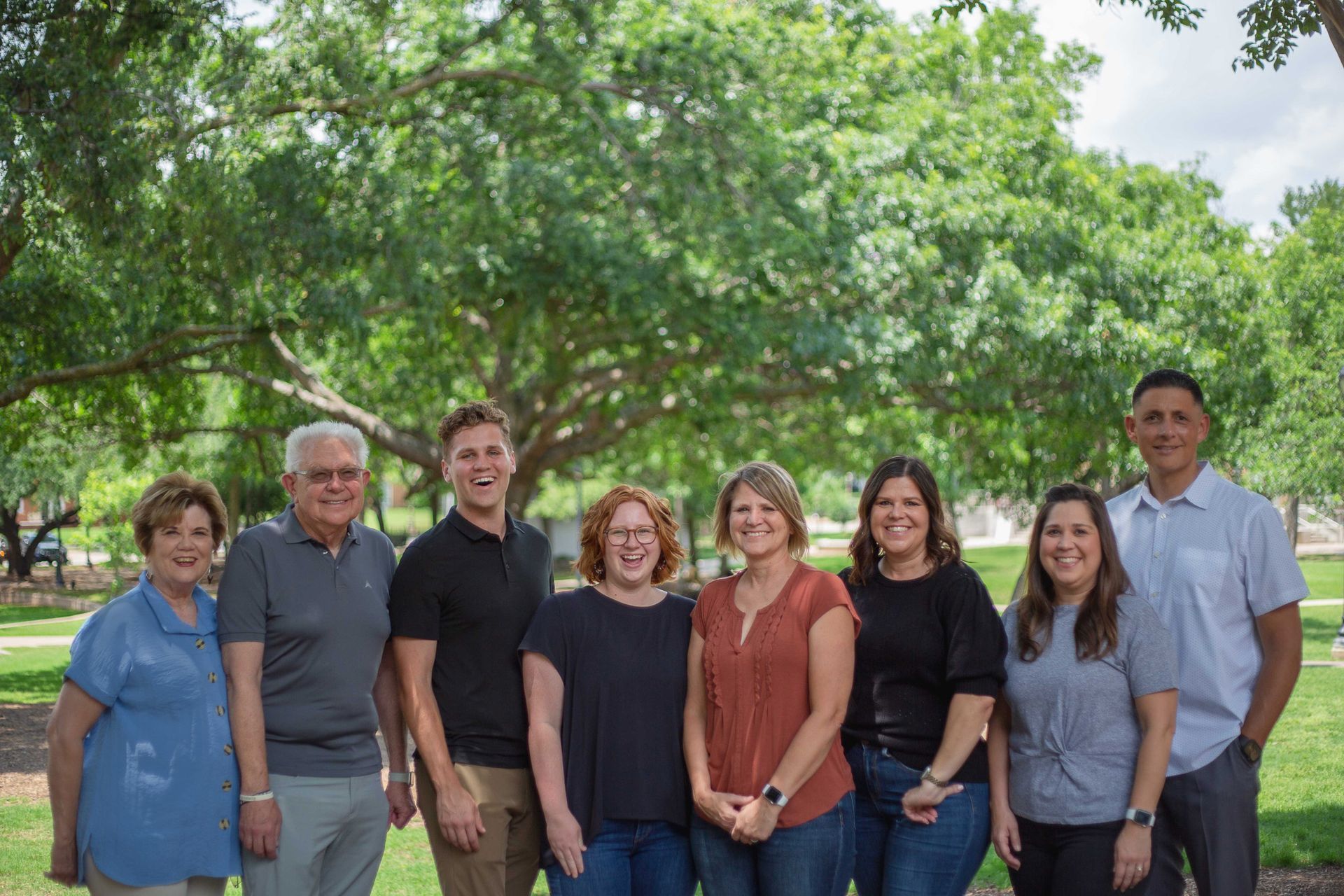
Staff Photos for a Landscaping Consulting Company in Dallas, TX I've been lucky enough to know members of the Moon family for years—specifically working with my friend Jen as a volunteer leader and tutor in an after-school tutoring program she's been leading in Far North Dallas! When I launched Sarah Rosie Studios and began taking gigs doing staff photography or corporate headshots , Jen texted to ask about getting new photos for their team over at Dr. R.E. Moon + Associates. Best. gig. ever!
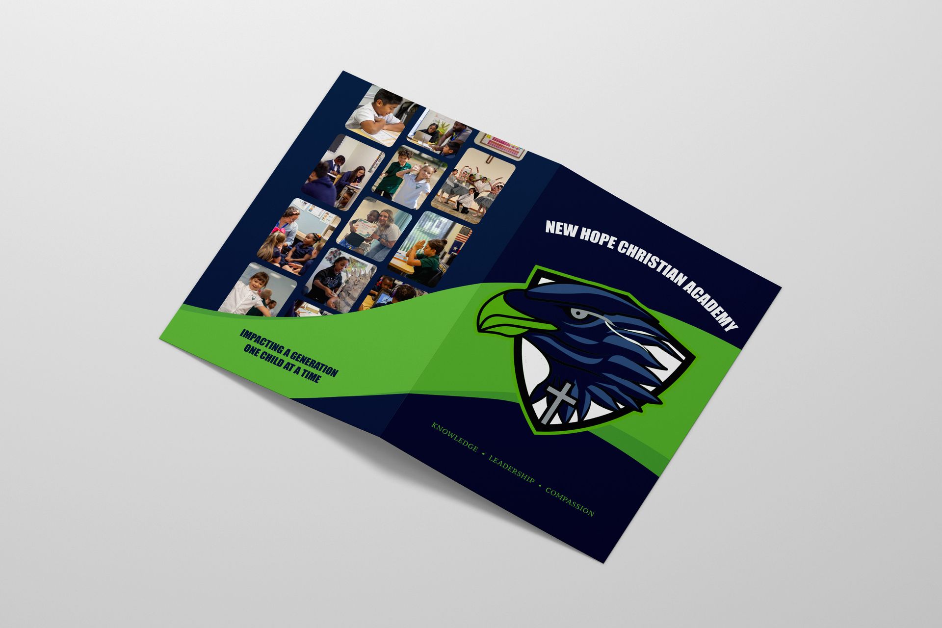
Freelance Graphic Design Project for NHCA New Hope Christian Academy is a private Christian school located in Plano. They reached out last summer looking for updated printed materials to give to parents interested in their uniquely flexible setup for students in elementary through high school!
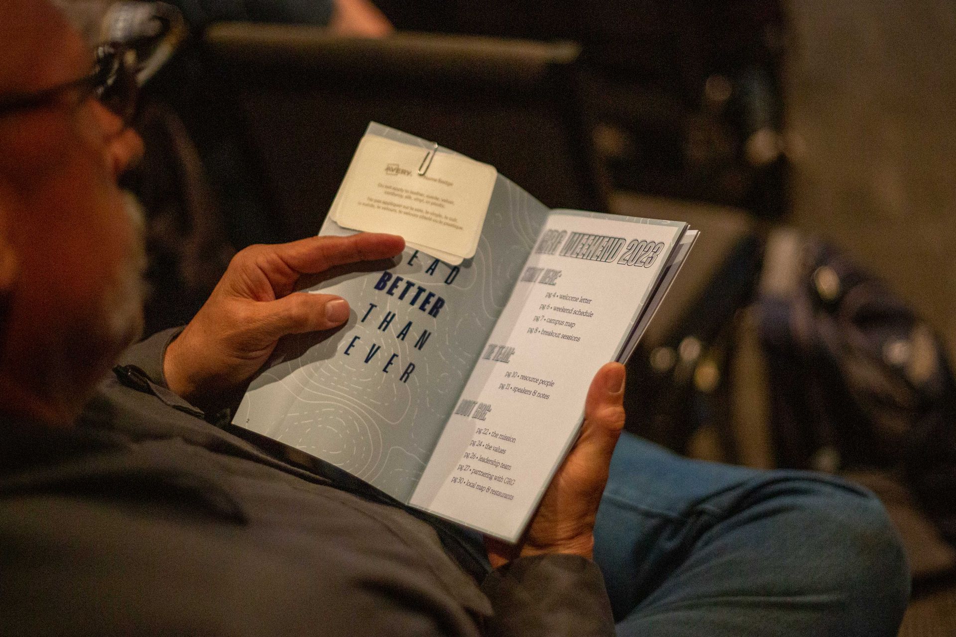
Conference Branding + Booklet Design for an International Nonprofit
Introducing Sarah Rosie Studios: branding photography and design for small businesses and nonprofits.